
Metaimpact · Hubs & Pages
Rebuilding the foundation for what comes next
I led a ground-up rethink of Metaimpact's content architecture and page editor because customers struggled to build on their own and our teams were spending too much time doing it for them. The goal was to make creating something good feel simpler, safer, and far less dependent on knowing the product inside and out. The cherry on top: once we stopped making people build everything one block at a time, more than half the work could simply disappear.
- Role
- Principal Product Designer · Sole designer
- What I owned
- Full concept and vision · Product architecture · UX strategy · Interaction design · Prototyping · Usability testing
- Worked with
- Engineering · GTM · Customer-facing teams · Marketing · Head of Sales · Leadership
- Status
- Alpha · 2026Open prototype
 BeforeAfter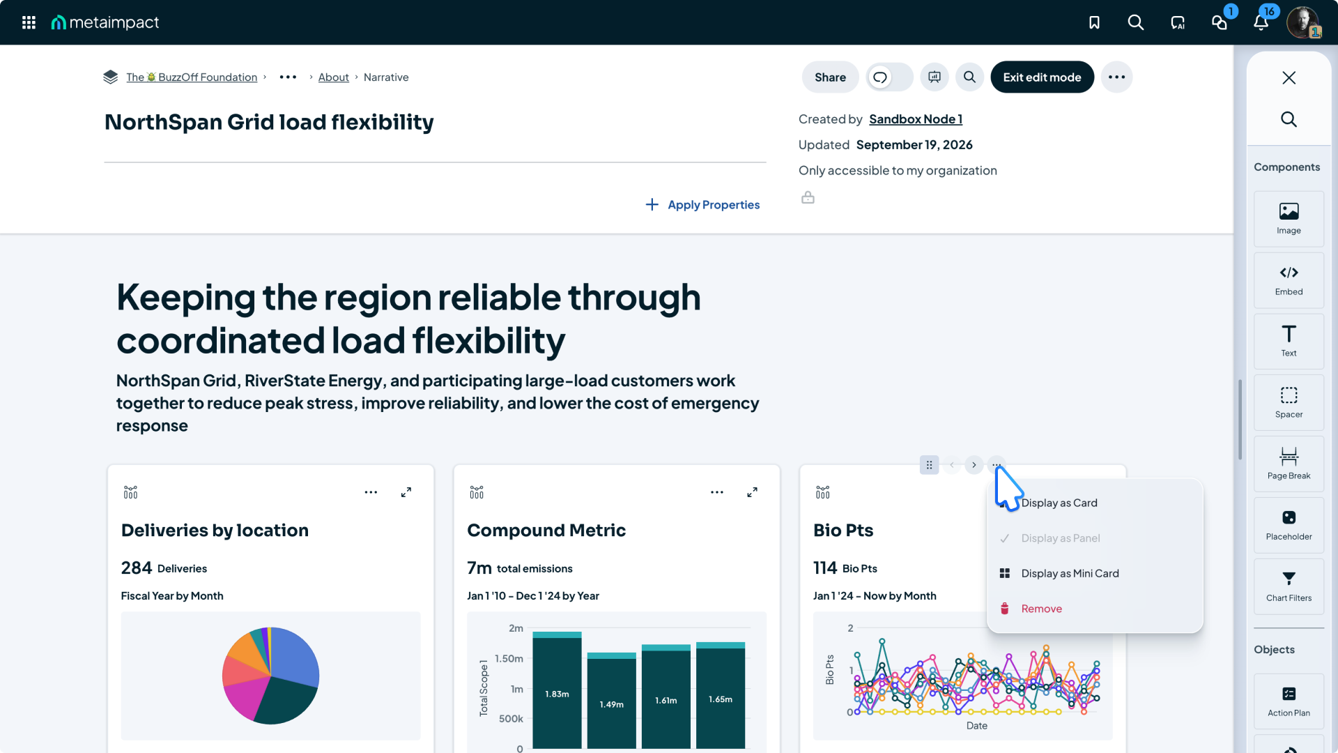
A quick primer
Metaimpact helps organizations coordinate big, messy networks of people, programs, partners, data, and outcomes. Most of what customers see lives inside something we called a Space, which could be anything from a simple page to a dashboard, report, directory, or entire network experience.
Then there were Profile Spaces, Narrative Spaces, List Spaces, Group Spaces, Pages inside Spaces, Lists inside Profiles, and objects living inside all of it. An object could be a metric, a contact, an organization, or another piece of information.
Don't know what any of that means? Welcome to the club. That was part of the problem.
Users weren't sure what kind of thing to create, where to start, or what a good network was supposed to look like. Once they figured that out, they still had to build nearly everything by hand. There were few useful starting points, no real templates, no AI assistance, and very few shortcuts.
Editing wasn't consistently safe either. Depending on what someone was working with, changes could happen live, undo wasn't dependable, and there wasn't a draft model people could trust.
So there was a lot of friction before someone ever got to the part they actually cared about.
The problem
The product was powerful. The experience wasn't.
Spaces could do a lot. That was never really the problem.
The problem was figuring out how to do any of it.
Before someone built a page, they had to understand what Metaimpact meant by a Profile, Narrative, List, Group, Page, object, network, and all the relationships between them.
And once someone got through the terminology, there wasn't much help waiting for them. You started with a mostly blank surface and built things manually. There was little inspiration or guidance. Useful templates weren't there. AI assistance wasn't there. Editing behavior changed depending on what you were working with.
So people did what you'd expect.
They asked us to build it for them.
Our internal teams knew Metaimpact better than anyone. They built in it every day.
And even with that expertise, the results often came down to white space, stacks of cards, text, and custom graphics created outside the product to help hold the story together.
If the people who know every trick in the product have to work that hard to get to something that looks merely decent, asking a customer to start from scratch and create something polished isn't realistic.
The original ask
We were creating Spaces to organize Spaces that pointed to other Spaces.
This project originally showed up as 'Spaces 2.0.'
The brief sounded pretty reasonable: make Spaces easier to find, easier to build, easier to manage, and better looking. Help customers choose the right type. Give them better starting points. Improve the cards. Clean up the navigation. Let people self-serve more often.
That sounded like an editor improvement.
Then I started mapping how real customer networks were actually being built.
And, well... things got a little out of hand.
A Profile Space might have seven or eight navigation items. Several of those might be List Spaces containing only two or three links. Those links point to more Narrative, List, or Profile Spaces. Those might contain more navigation and more lists of more Spaces.
The energy example below is a real build our CEO uses today. Follow just one path through it and you can easily hit 15+ separate Spaces before exploring the other branches.
The meat and potatoes of one story had been spread across a small website's worth of destinations.
More Spaces created more navigation and organizational noise, which led teams to create still more Spaces just to organize the ones that already existed.
The shift
What if customers didn't have to know any of this?
That became the question.
Instead of asking people to choose among Profile, Narrative, List, and Group Spaces, I reduced the model to a few things with clear jobs.
A Hub organizes the work.
A Page tells the story.
Sections organize the Page.
Blocks are the things you put on it.
Rows and columns still exist, but mostly so the editor can do its job. The user shouldn't have to care.
Now a metric doesn't need another destination. A list doesn't need to become another Space. Organizations, contacts, data, media, and narrative can live together on the Page where they actually make sense.
I developed the full concept and pitched it to leadership. They backed it. With no one in Product at that point, engineering and I worked together to decide what to build first and how to roll it out.
The editor
People needed somewhere safe to screw up.
The old experience didn't give customers much room to experiment.
Some editing happened inside an editor. Some changes happened live. Undo wasn't dependable. There wasn't a consistent draft model people could trust.
That makes people cautious.
And cautious users don't experiment. They create throwaway test Spaces, ask someone else to make the change, or simply leave things alone.
So the new editor starts with a very basic promise:
Go ahead. Try something. You're not going to blow up the network.
Authors can work in a draft, make changes directly, undo mistakes, preview the result, and decide when the work is ready to publish.
It sounds obvious. For Metaimpact, it changes the relationship people can have with the product.
I designed the editor in Figma, then used Claude Code to build a working prototype from those designs and my interaction rules. That let me try the behavior myself and work through the details with engineering before they built it.
Working interaction prototype
Try selection, resizing, undo, preview, and the draft/publish controls.
Designing the interaction
Powerful doesn't have to mean complicated.
A page builder could easily solve one complexity problem by creating another.
I wanted enough flexibility to build rich pages without asking customers to become page designers.
Move content, not containers
Drag the content you want to move. The editor shows where it can go and handles the rows and columns underneath.
Resize visually
Drag a boundary to make content bigger or smaller. You can see the result as it snaps into place, without digging through menus.
Let the system handle the polish
Choose a background or how tightly content should fit. The editor takes care of readable text, coordinated spacing, and smaller screens.
Don’t start everyone with a blank page
Start with a useful section and placeholders that show what belongs there. Then change it to fit your story.
User testing
Some of my ideas were wrong. That's what testing was for.
The overall direction held up, but that wasn't the useful part.
The useful part was finding the places where something I designed made sense to me and not to the person actually trying to use it.
So we changed them.
Initial approach
Hover options bar
Authors had to maintain a hover state, open a small options bar, and click again to reach formatting.
What changed
Direct selection
One click opened text editing and useful formatting without covering the work. I applied that pattern to every block, removing 1–3 clicks from common edits.
Initial approach
Bounds only on hover
Empty text blocks could disappear completely, and authors could not see how selected content related to its parent containers.
What changed
Contextual bounds
Subtle outlines stay visible, even around empty content. Selecting something makes its outline and the containers around it easier to see.
Initial approach
One Finish menu
Save, publish, exit, and secondary actions lived behind one button. Less navbar noise created uncertainty at the end of an edit.
What changed
Clear completion actions
Save, Publish, and Close became separate actions. Less common choices moved into overflow.
Why it matters
The payoff is bigger than a better editor.
Today, our go-to-market team, or GTM, spends roughly half its time building and maintaining customer networks and Spaces. These are the people who help customers get started and succeed.
That service helps customers succeed. It also tells us something important: too much of the product's value still depends on someone inside Metaimpact knowing how to assemble it.
Hubs & Pages is meant to shift that balance.
Customers get a safer place to build and experiment.
GTM can spend less time doing routine construction for customers.
Sales gets a much stronger canvas for showing what Metaimpact can become.
Product and engineering get one model they can keep extending instead of inventing another kind of Space every time the platform needs to do something new.
During usability testing, I asked our CEO to edit a Page I had created in the Alpha editor. He initially thought engineering had hard-coded it for the test. He was surprised when I told him I had built the whole thing using the editor.
AI assistance
AI can build a draft instead of asking permission after every step.
In the legacy editor, every change had to be made and saved independently.
An AI agent would inherit the same limitation: change the headline, ask for approval. Add an image, ask again. Add a metric, ask again. The user wouldn't even get to see how the pieces worked together before being asked to approve them.
The new editor gives Beacon, Metaimpact's AI assistant, somewhere safe to work.
It can assemble meaningful parts of a Page first, then let someone review the result in context, fix what isn't right, undo changes, and publish when they're ready.
Old
New
A blank canvas isn't freedom if you don't want to design a page.
Some people know exactly what they want. Let them start blank.
Some people have an idea but need help turning it into something good. Give them section types, placeholders, and templates.
And some people frankly don't want to build the page at all. They want to explain what they need and get back to their actual job. That's where Beacon comes in.
Start blank... with a cheat code
Build your own Page with section starting points and placeholder blocks to help you get moving.
Describe it to Beacon
Tell Beacon what you’re trying to create and let it assemble a first draft using the same sections and blocks available to a human author.
Use a template
A proven structure with layouts and placeholders already in place, ready to customize.
A template gives you the recipe.Beacon can make dinner.
Where it stands
Still building. Still learning.
Alpha means we're testing with our own team. Next comes a beta with selected customers, then a broader release as the editor and additional blocks are ready.
The work isn't finished. We now have something concrete to try, learn from, and improve together.
In Alpha
Text, images, and core editing
The team is testing the responsive layout, draft model, and editing interactions internally.
In progress
Testing and refinement
Follow-up internal testing and fixes before an external customer beta. Nothing has been released to customers yet.
Designed next
More content and creation paths
Object blocks, properties, hubs, reusable starting points, and Beacon-assisted creation. Designs and prototypes are ahead of the Alpha build.